Friday 22 October 2010

Evaluation of College magazine- Front cover


I wanted to create a college magazine that would appeal to students at WYKE college. So i specifically aimed it at these students. I named the college magazine WYKE it's short, simple and straight to the point. I originally thought of calling my college magazine WYKE association, i would of kept WYKE big as it is in the final cover with a smaller font for the 'association' part but when i tried this it didn't look very good. 


I took quite a few pictures, but when choosing an image for my main image on the front cover i felt quite limited. This is because as i re-read the brief and realised the main image had to be a medium close-up shot i realised i did not have as many of medium close-up shots as i would of wanted. Also many if my images were not of good enough quality to be used. However i am happy with my main image as it fits in with the conventions of a hard working student although he does not fit into all conventions of a purposed 'geek' getting on with his work, which gives a cross of a moral that you don't have to be a 'geek' to do your work. Which is the obvious aim of a college environment.

I also chose to take most of my pictures in the new library and the newly opened grassed area showcasing the new facilities. I think this works well with the new image of the college.

I originally used the font TW cen MT but decided to change this to Soho pro for my final front cover. I did this because i felt Soho pro stood out more and made the writing stand out more. I used the same font in my masthead and cover lines to create an on-going convention within its own individual college.

I positioned my bar code in the bottom left hand corner which is also a convention of any magazine. Although college magazines do not usually have bar codes as they are usually free of charge, i decided to use a bar code as it makes the magazine look more important also in case the college decided to charge for the college magazines.

 I used cover lines i thought would catch a college students eye, that would keep them enthusiastic about their college and interested on ongoing events. I did not use all my purposed cover lines i had originally thought of, but as i looked at my images i was influenced on different headlines.

 I chose to put some images also on my front cover, which is not a necessary convention of a magazine but i felt it bulked it up a bit more, and made the magazine look more exciting. It also gives an opportunity for more students to be displayed which in turn will entice more readers.

I chose to use one academic, professional looking photo and one of some students having fun on the new grass , creating human pyramids in a mid action long shot. I backed these images on a black border so that they stood out from the main image.

I think overall this is a good college magazine front cover, i think i could have maybe improved the main image and used a more creative font and colour scheme, but i think i achieved the simplistic, clean layout convention of a college magazine front cover.


Final College Magazine Front Cover


This is my final front cover for my college magazine. I kept everything basically the same as my first mock up as i liked the design. I added an extra headline in 'UCAS- how to be successful in your application'. I also changed the font of each element to Soho pro. I felt this was more appropriate for a college magazine and helped it to stand out.

Thursday 21 October 2010

Potential College Magazine Front Cover

Mock up of contents page

Front cover draft


This is a mock up of how i will set my college magazine out. I will not necessarily stick to this but it is an idea for me to follow in order to create a front cover of a college magazine using conventions.

Some Images i took, for my college magazine

 I like this image, i think it portrays a fun aspect of college whilst using actual students which would draw the audience to the magazine. The only problem i can find with this picture is that it is not a medium close-up shot so therefore cannot be used for my front cover.


 I think the lighting in this picture is really good. The colours are all very vibrant and bright. The picture portrays a moral of teamwork and also fun to the aspect of college. Again the only problem i can find with this picture is that it is not a medium close-up shot so can also not be used for my main image.

 This is a medium close-up shot of a student who is smiling. This could be used as my main image. I have decided not to use this as my main image, as i do not think it is good enough quality. The lighting is not good enough and also i do not feel the student is centred enough. 
This is a nice picture of two students playing a game of chess. The quality however is poor, so therefore will not be used in any aspect of my magazine.
This is again another nice image of two students playing chess. It is however of better quality and i may decide to use this in one of cover stories, although it is not the best quality image.
 I will not be using this image, as i do not feel it fits into the conventions of a colleg emagazine. The student is neither looking at the camere, laughing or getting on with her work.
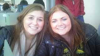
This is a good picture of two happy students. It is a medium close-up shot so fits the conventions of a college magazine in that aspect. However, it is a landscape image so because of that it would not work. I don't think i will use this image.


This is a good image of a student getting on with his work in the newly built library. However his face is a little bit to low down, so i therefore wont be using this image.
This image is very similar to the one above, the diference being that his head is slightly more arisen with a slight smile on his face. This is a great example of a medium close-up shot. It also portrays a hardworking student. I think this may be the image i use.
This image is off really high quality. It is a great image of two students getting stuck in on some practical photography work. I would love to use this as my main image but it would not fit any conventions. However i think it would make a good coverline story image. I will definately be putting this image somewhere in my magazine.

Wednesday 20 October 2010

Contents page mock-up


This is a mock up of how i will set out my contents page. It is clean, simple and fits into the conventions of a college magazine contents page. I may not necessarily stick to this layout.

LIIAR analysis of a college magazine


This particular college magazine is particular to its denotation of basketball using technical lexis of which are specific to basketball enthusiasts. The colours used are simple (blue, red, white and black) which draw the readers attention as each colour stands out. Also as the magazine is published once each year it is important that the magazine stands out. I am aware that it only makes one copy a year as it does not have an issue number under the masthead instead it states the year 2009-2010.

It obeys most conventions of a college magazine front cover although there is not enough cover lines of inside content which can make it less appealing to the audience. This college magazine front cover is American, so it is aimed at students who are currently at the English equivalent to university. Therefore it is aimed at students of whom the majority age is between 18 and 23. This college magazine is all about basketball therefore there is a predominant male audience also.

The main image is of John Caliparia a basketball coach from the university of Kentucky. This is proven by the main headline although if the headline was not there the way he is dressed suggests he is high up in the world of basketball, as he is wearing a polo shirt instead of a basketball tank top which suggests a more professional role this is also shown by all the buttons on his shirt being fastened, it is also very clean and uncreased creating a professional look.This is a specified sports college magazine aimed at basketball enthusiasts this is known as the masthead is 'college basketball'. From the text we also know that this magazine is not for one particular college as in the top left hand corner there is a logo for Athlon sports which also states 'americas premier sports annual' which suggest there is more than just the college basketball annual magazine and there is ones for other sports such as soccer. The price is in dollars as it is an American college magazine this is placed in the same box as the bar code which is in the bottom right hand corner. As this magazine has a bar code it suggests that it is sold in a shop. Under the masthead there is also a website for the magazine which suggests it is a popular magazine. Overall this college magazine fits into most conventional stereotypes of a college magazine.


Hand drawn mock-ups of college front cover and contents page


Friday 15 October 2010

Preliminary headline ideas

Wyke's 3rd legendary Halloween Party- Are you trick or treating?
UCAS-how to be successful in your application
NUS card's- buy yours now
Wyke Theatre- upcoming performances
Enjoy singing?- join the college choir
Exclusive- Meet the new student executive's

Saturday 9 October 2010

Research of college/school magazine front covers

LIIAR interpretationof the brief


Using the acronym LIIAR we looked at how the media key concepts could be applied whilst producing a college magazine.


Language - This covers the layout including; the masthead, selling line, main image, coverlines, dateline, bar code and model credit.


Institution - The institution will be for Wyke college. As this is the business that is creating the magazine.


Ideology - Is the values and beliefs the magazine will portray. A college magazine will be promoting education, events involving college and respect for the college and students.


Audience - This is what target audience will be aimed at. As it is a college magazine it will be aimed mostly towards 16-19 year old males and females who are in full-time college education. There will also most probably be sections aimed towards teachers and parents.


Representation - This is what the magazine portrays. Sections that may ommit students/teachers/parents opinions and be more personal to individual groups.

Friday 8 October 2010

Conventions of a college magazine contents page

  • Heading

  • Subheadings

  • Page numbers

  • Image/s

  • Special features section

  • Regular section

  • Contact information

  • Highlighted stories

  • Editors letter

  • Simplistic, easy to read layout
  • Conventions of a college magazine front cover

    • Main image (usually a student in medium close-up shot)
    • Masthead
    • Date of issue
    • Barcode
    • College logo
    • Colourful
    • Website
    • Headlines
    • Appropiately laid-out text
    • Simple layout

    Wednesday 6 October 2010

    Preliminary Task

    Using DTP and an image manipulation program, produce the front page of a new school/college magazine, featuring a photograph of a student medium close-up plus some appropriately laid-out text and a masthead. Additionally, you must produce a mock-up of the layout of the contents page to demonstrate their grasp of DTP.